Project Details

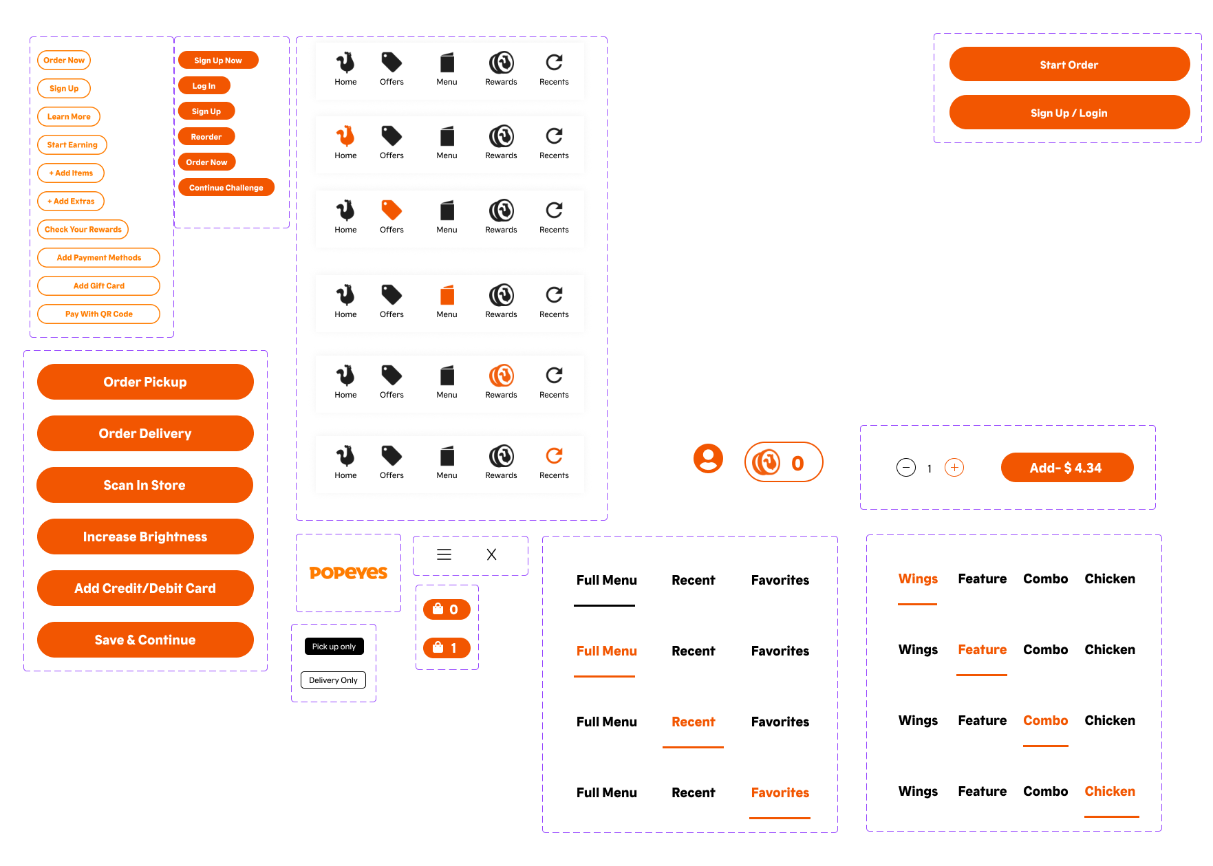
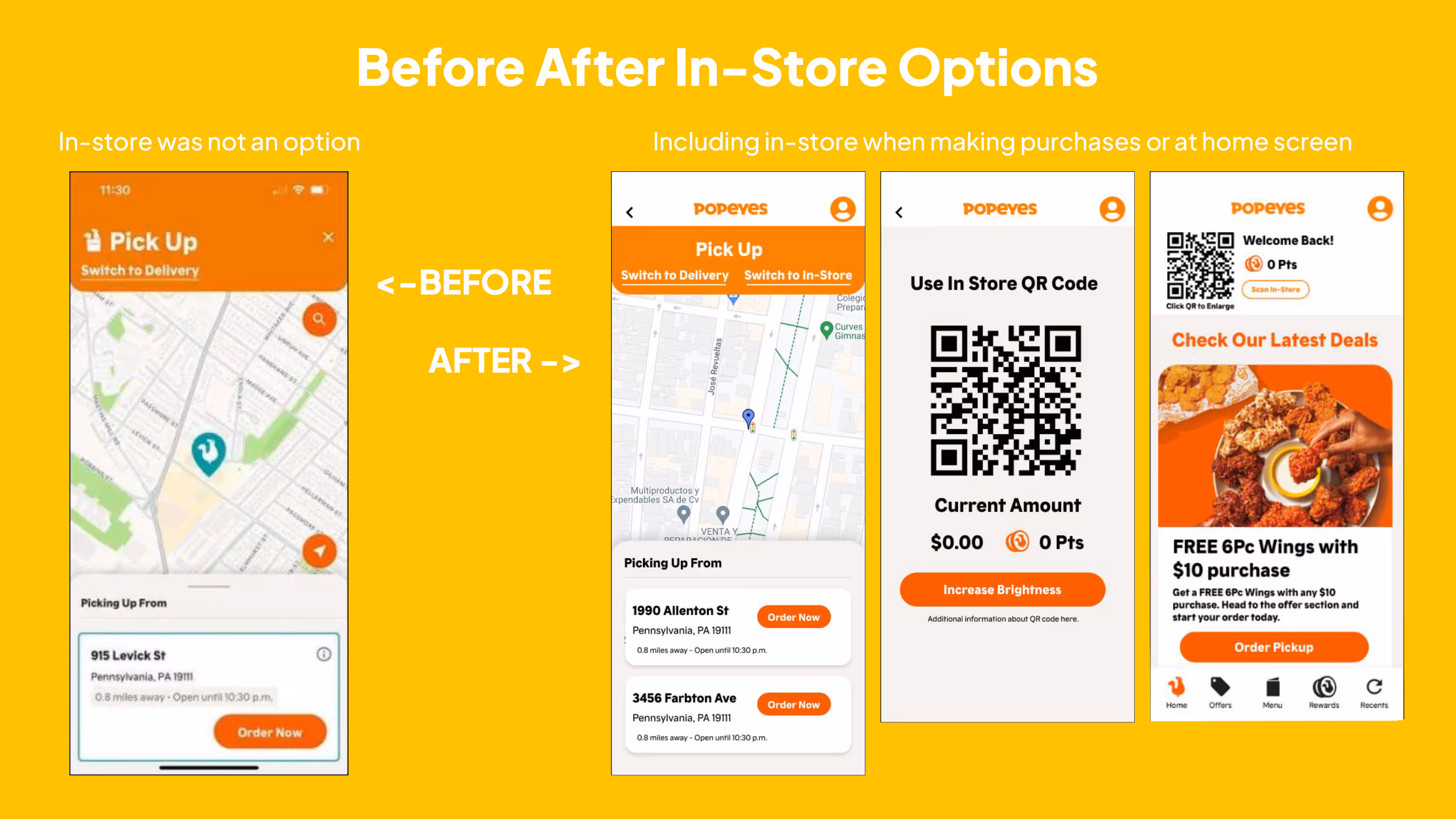
Popeyes is an American multinational chain of fried chicken restaurants formed in 1972 in New Orleans, Louisiana. Seeing how much Popeyes is growing as a fast food chain, and as a  fan for Popeyes food. In 2024, I wanted to find ways to improve the experience between Popeyes mobile app for customers new and existing. Outside of my personal experience with the app, I conducted limited research, user testing, usability plan, research summary, wireframing (Low-fi to hi-fi), UI library development and Hi-fidelity prototyping within a span of 8 weeks for this project.

The Problem

Popeyes' mobile app in 2024 did not support common transaction methods such as cash, Venmo and PayPal. Without these additional payment options, customers are limited with how they can transact and limit their ability to use in-app rewards, impacting app loyalty to existing and potential new customers. 

How Does it Impact Customers?

Customer A

As someone who dines in-store, I want the option to link my in-store purchases to the app, so I can earn and redeem rewards for both online and offline transactions.

Customer B

As someone new to Popeyes, I expect a variety of payment options and rewards that allow me to order online, so I can be encouraged to download and use the app for my future orders rather than opting to go in-store.

Customer C

As someone who frequently goes to Popeyes, I want the ability to redeem my points directly within the Popeyes app. so I can enjoy free items without any hurdles.

The solution

Based on the customer pain points along with limited research and feedback from participants who had experience with fast food ordering. I come to the conclusion that the following three areas must be tested: payment options,  easy to redeem rewards, and a seamless scan in-store experience.

Low- Fidelity Wireframe
Design System
Portion of Popeyes' design system was created to help maintain consistency.
User interface design elements for a food ordering app including navigation menus, buttons for order pickup and delivery, sign up and login buttons, menu categories, and icons for rewards and recent orders.
Usability Testing
I reached out to the same 5 participants from my initial research to conduct usability testing using a hi-fidelity prototype. Below are the results.
Infographic showing user testing outcomes with 60% unaware of QR overlay, 80% clicking profile icon instead of menu, and 100% confusion with rewards redemption.
Hi-Fidelity Wireframe

The Result

I made additional adjustments to the wireframes based on the feedback provided in the usability testing. As a result, I was able to reflect the customer needs by giving multiple payment options, have an easy to redeem rewards function, and a seamless scan in-store experience.

Flow DiagramComparison of Popeyes app payment options before and after update, showing older interface with limited methods and new interface with additional payment choices including Google Pay, Apple Pay, PayPal, Venmo, and secure order completion screen.Comparison of Popeyes app screens showing before and after adding in-store pickup options with map locations, QR code for in-store use, and promotional deal for free wings with purchase.

View Next Project